Six Day War persuasive cartography: a demographic map of Israel and the Arab states in 1969.
Israel and the Arab states – Area and population
Out of stock
Description
This fascinating map of the Greater Middle East was produced to show the discrepancy in demographics between Israel and the Arab States. The map uses simple graphic tools, such as coloring and map symbols representing specific values, to distinguish these two groupings from each other. A counterpart was also published in Hebrew.
The map’s purpose is essentially a form of propaganda, or at the very least, manipulation of the deep emotions associated with the existence of a Jewish state. The map does not provide erroneous or false information, but it does set up a dichotomy in which the viewer is quickly enticed to feel sympathy and support for Israel: a country surrounded by hostile neighbors on all sides. Such sentiment, anchored in reality, is underscored in this map, which visualizes Israel’s exposure and regional position. One might add that it constitutes an excellent example of the subtleties used in 20th-century propaganda.
Exploring the propagandistic subtleties further, one might first note the coloring of the map, which aligns Israel with the rest of the world – in particular Europe (and thus, by proxy, America). Israel is depicted in the same color as the surrounding world, which, at least on the face of it, has no stake or vested interest in this conflict. The mapmakers are, in other words, portraying Israel as a legitimate part of the world, subject to illegitimate attacks from their neighbors, a notion that rang true at the time.
The Arab countries, on the other hand, have all been colored green. Their numbers include countries like Morocco, Oman, and Sudan, which have little to do with the conflict, but which help inflate the problem, making it seem even more insurmountable than it was. Countries like Iran have been kept out of the sphere of conflict represented in this map. The reason for this is that this map was produced in 1969 – two years after the Six Day War, but an entire decade before the Islamic Revolution permanently changed the trajectory of Iran.
Another highlighted element that separates the Arab nations from Israel is population numbers. On the map, populations are represented by pictorial figures in the traditional garb of each country. Each human figure represents one million inhabitants, which is why in many cases, one sees a certain number of whole figures followed by a fraction of one. Once again, this information underlines just how formidable the challenge of defending Israel and her citizens was. The seeming threat created by these highly disproportional numbers serves to counter the popular narrative established by Israel’s military success in the preemptive Six Day War. This conflict, which was over almost before it started, saw most of Syria’s, Jordan’s, and Egypt’s military capacity destroyed. It also led to a rapid Israeli annexation of enormous swathes of Arab land for security purposes.
The annexed regions remain a significant source of conflict to this day and include not only the Golan Heights from Syria but also the West Bank and East Jerusalem from Jordan and, most visibly perhaps, the Sinai Peninsula from Egypt. The redrawing of borders in a region prone to conflict did increase Israel’s military security for a time, but it also prompted heavy condemnation from the surrounding world and the United Nations. Noting how all three of these annexed areas have been included as complete parts of the State of Israel, one might speculate that cementing the territorial expansion in the minds of Israelis and their global partners was one of the chief purposes of this map. Israel occupied Sinai as part of the war in 1967 and held onto it for more than 15 years. Only with the Egypt-Israel peace accords, signed in 1979, was Sinai finally returned to Egypt in 1982.
The current map was printed as part of a series of now scarce maps that served to justify and explain the status quo in 1969. Israel had come under heavy international criticism for its long-term occupation of non-Jewish territories, and these maps helped explain the situation to Israeli citizens and the large Jewish diaspora, which generally remained faithful to Israel. However, being printed in English, there is no doubt that the primary audience of this map was a sympathetic America. A comparison of our map to other maps from the same period and publisher sheds light on its intended audience. One example is found in the PJ Mode Collection at Cornell University. This double map, entitled Israel and the Arab States / The Arab Deployment for Attack 4 June 1967 (ID no. 2246.01), is kept in the same color nuances and applies the same fonts and typography as our example. While the upper map essentially repeats what is being shown on our map, the lower one zooms in on the region to show in detail the Arab attack plans that were subdued by a swift attack from an efficient Israeli army.
While our map may appear innocuous at first glance, with its emphasis on borders and population numbers, this is part of the Israeli propaganda associated with the longevity and uncompromising defense of the fledgling state. Produced with the Six Day War still fresh on people’s minds, it reminded the world of Israel’s exposed position and the dire need for military strength. It is, one might say, a practical map created by the titanic impracticalities of history.
Cartographer(s):
Merkaz Ha-Hasbara is the information office of the Israeli government and the formal publisher of information by the State of Israel.
Condition Description
Wear along folds and two minor pin holes in upper corners.
References
Related products
-
-
Add to cart

- Eastern Mediterranean - Holy Land
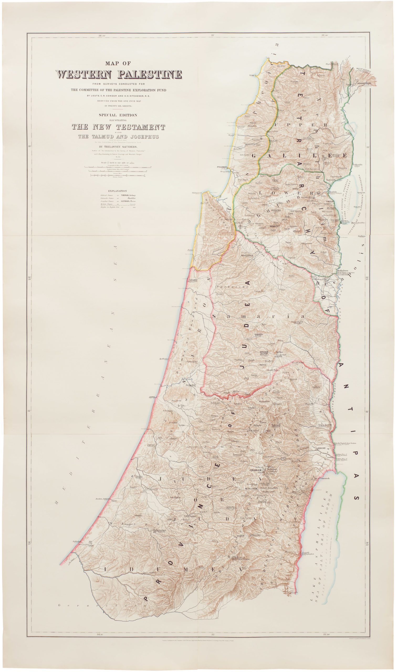
Map of Western Palestine from surveys conducted for The Committee of the Palestine Exploration Fund. By Lieuts. C. R. Conder and H. H. Kitchener, R. E. Reduced from the one inch map in twenty six sheets. Special Edition Illustrating The New Testament also The Talmud and Josephus (after the birth of Jesus)…
- $1,000
-
-
-
![PORT OF SAN FRANCISCO. WHERE THE FAR EAST BEGINS [Japanese language version]](https://neatlinemaps.com/wp-content/uploads/2021/01/NL-00879_Thumbnail-300x300.jpg)
![PORT OF SAN FRANCISCO. WHERE THE FAR EAST BEGINS [Japanese language version]](https://neatlinemaps.com/wp-content/uploads/2021/01/NL-00879_Thumbnail.jpg)