A spectacular set of four continental maps, likely colored by Dirk Janz van Santen, the finest cartographic colorist of the Dutch Golden Age.
Novissima et accuratissima totius Americae descriptio; Accuratissima totius Asiae tabula recens emendata; Totius Africae accuratissima tabula; & Nova et accurata totius Europae descriptio. Per FREDERICUM DE WIT.
Out of stock
Description
A one-of-a-kind set of Frederik de Wit’s continental maps, with expertly executed and pristinely preserved original coloring.
Printed in Amsterdam circa 1680, the maps constitute a first state set of folio maps depicting Europe, Asia, Africa, and the Americas (North and South). They have been elevated to works of art through their illumination by a Dutch master colorist, whom scholarly consensus believes to be the unparalleled Dirk Janz van Santen (1637/8-1708). Among the hallmarks of Van Santen’s work found on these maps are the splendid red and yellow borders, with red painted over the engraved neatlines, and the extensive use of gold (more below).
Van Santen was the artist who gilded the Golden Age of Dutch cartography. Writers and poets celebrated his work, and by the early 18th century, collectors traveled across Europe at the chance to acquire a tome illuminated by the master. Zacharias Konrad von Uffenbach, the mayor of Frankfurt, in his Merkwürdige Reisen (Ulm, 1750-54), wrote about a visit to Amsterdam in 1711, noting the competition between dealers and collectors to get their hands on Van Santen’s work.
An Extraordinary Colorist: Van Santen’s Technique
Both his contemporaries and the generations after his death celebrated Van Santen’s coloring. Part of what made his work so distinctive and desirable was that Van Santen was lavishly generous, not just in the selection and application of pigments but also in his use of gold. His sense of chromatic juxtaposition and layering was far beyond the work of his contemporaries and has been attributed to an almost impressionistic palette and style.
Van Santen mixed his own pigments, experimenting with various techniques to achieve the exact nuance of color he envisioned. Consequently, many of the tones he used on maps were virtually unique to him. And if one did not recognize his work from the palette alone, then certainly the play of contrasts or the inspired flights of coloring fancy quickly gave away that this was the work of a master.
Van Santen’s generous application of gold also sets his work apart. He would apply gold to everything, from borders, towns, and cartouches, to inserting entirely new elements like patterning the clothing of vignette figures, veining stones, or highlighting frontiers. Gilded areas would often be set against sharp contrasting colors, usually made of expensive pigments like ultramarine blue or carmine red. This play of color and gold would be applied to all elements of a map. Still, especially borders and edges received much attention, framing the map exquisitely and expertly camouflaging inserted maps or prints.
Unlike many of his contemporaries, Van Santen avoided anything that could appear monotonous or monochromatic. Empty spaces were brought to life by endowing the entire surface with color – sometimes kept transparent or opaque – but always playing against the graphic lines of the engraving. This devotion to ill- or undefined spaces is also seen in Van Santen’s attention to ephemeral expanses like skies, oceans, or horizons. Perhaps it was the creative freedom that these spaces allowed which attracted Van Santen. Regardless, he mastered them by building a systematic approach to color progression.
For skies, for example, this meant that the foundational blue was mixed with more and more opaque white, which then melted into an opaque pinkish white, then pink, until graduating into light yellows and greens before culminating at the contrasting interface of the horizon. For highlighting terrestrial spaces on maps, Van Santen mostly used browns, greens, and the white of the paper for topography, supplemented by the sharply contrasting and often polychromatic coloring of regional delineations and gold for places. This latter trend is clearly seen in all four maps of this set.
The extensive gilding for which Van Santen was famous is generally one of the hallmarks of our maps. Here too, Van Santen distinguished himself from his peers by going beyond the traditional approach of only gilding decorative elements like cartouches and heraldry. Instead, he vigorously applied gold to various elements, including dotting cities, highlighting toponyms, and delineating frontiers. And he did not stop there either. In his best works, gold is ubiquitous: from legends and tables to borders and vignettes. Consequently, cartographic historians have divided his oeuvre into three overall categories:
- Maps colored without gold;
- Maps in which gold was applied to the cartouches, coats-of-arms, and decorative elements; and
- Maps on which gold was applied to the actual mapped space itself
In the 17th century, the application of gold leaf to maps was no longer in vogue. Instead, shell gold was used. Van Santen may have developed his own application method consisting of finely ground gold leaf mixed with honey, salt, distilled water, and vinegar for consistency. It was an expensive process, and there can be no doubt that Van Santen’s exuberance was entirely contingent on someone else footing the bill.
Provenance
Antiquariat Paulus Swaen (Pierre Joppen) sold the set to the well-known Scandinavian collector Gunnar Skoog, who kept the maps in excellent condition until we acquired them at Sotheby’s (Travel, Atlases, Maps and Natural History, 28 July 2020).
The Americas (Novissima et accuratissima totius Americae descriptio)
This magnificent chart of the still partly obscure American continents has been celebrated as an important development in the Dutch mapping of the Americas. It carries all the hallmarks of a great 17th-century chart: from elaborately decorated cartouches to visual depictions of the great wilderness that characterized these young continents. Most of America’s northwestern plains remain a largely unexplored Terra Incognita, complete with fur-bearing games such as wolverines, bears, and foxes. The Pacific Northwest is entirely absent from the chart.
Our copy is the first state of this map, published in Amsterdam in 1675 (Burden, 465). We can conclude this with certainty by identifying a number of features that in combination only figure on the original state. First of all, we note the subdivision of longitudinal lines into exact tens: from the third state on, longitudinal lines occur in ten-degree intervals from the 8th degree (i.e. 18 to 28 to 38, etc.). Secondly, we observe the inclusion of no less than eleven ocean-going ships, which have been omitted from the fourth state of this map. And finally, we note that the island of Madeira has been labeled Madera, whereas from the second state on this attribution is erroneously made to the Canary Islands. In combination, these three features unequivocally confirm Neatline’s copy as a first state in original coloring.
De Wit had produced his first American chart in 1660 and a second more monumental wall map in 1672, but both of these were characterized by a paucity of credible geographical information. It is almost as if De Wit was aware of his wall map’s shortcomings because not long after he had published it, he began working on this much more accurate and comprehensive chart. While this new version clearly builds on his previous American charts, it was also informed by Guillaume Sanson’s 1669 map of North America, which provided much of the latest reliable information – especially in the French territories. The discrepancies between his own American charts and Sanson’s work seems to have motivated De Wit to produce something even better. It is likely that it was this competitive drive that lead to this new and spectacular chart.
De Wit’s 1675 chart included a number of important new additions, the most important of which undoubtedly was the inclusion of all five of the Great Lakes in the Midwest: Lac Superieur (Lake Superior), Lac des Puans (Lake Michigan), Mare Dulce (Lake Huron), Lac Erie (Lake Erie), and L. de S. Louis (Lake Ontario). However, the western coast of Hudson Bay has also been significantly updated, as have political demarcations in North American. The latter is emphasized both by extensive labeling, but more importantly by means of highly distinct regional colorations in the original green, pink, and orange colors.
Another important feature of this map is that California is depicted as an island. This cartographic enigma, which is celebrated by many collectors, began in earnest around the 1620s when maps of North America suddenly began depicting an Insular California. The notion developed following early Spanish expeditions up the Pacific coast. In particular, the writings of a Carmelite friar, Antonio de la Ascension, seem to have promulgated the idea among Spanish mariners and cartographers, and from here it soon spread to the formerly Spanish domain of the Netherlands. Throughout Europe, the competitive cartographic markets hungered for fresh information on the new world, and often ideas would be incorporated without much critical verification. It was all about being first.
The California-as-an-island idea had thus been well established by the time De Wit compiled his charts. Important predecessors such as Hendrik Hondius, Nicolas Sanson, and John Speed had all been taken in by the notion and included it prominently in their charts. It was, in other words, neither strange nor out of place for De Wit to follow in this tradition. In many ways, this De Wit map represents a unique point in time in which the geographic myth had transcended into cartographic reality, and before it was first debunked by Father Kino, who traveled the Pacific coast and verified the peninsular nature of California himself. Kino published his observations in Paris in 1705, but the insular depiction continued well into the 18th century.
Even though South America seems to have been portrayed in full, there are still many aspects of its depiction that reveal it to be riddled with speculation and mythology. Highly important is of course the depiction of Cape Horn, as this was the only known route from the Atlantic to the Pacific at the time. While the Straits of Magellan and the Straits of Le Maire (Lemair) have been depicted fairly accurately, the map also includes a Strait of the Brouwers, which runs between the known State Island (Staten Lant) and a second undefined island to the east, which does not exist.
Like in North America, De Wit has used the open swathes of unknown wilderness for artistic depictions that were meant to instill wonderment and excite the imagination. We have mentioned the wild mammals on the Great Plains and similar use is made of the Amazon, where indigenous villages and combat scenes fill up the uncharted space. While still a largely unexplored region at the time, the Amazon includes an extensive network of rivers extending from the unknown interior to their various deltas on the coast. As waterways constituted the only transportation infrastructure through the dense vegetation, it is no surprise that rivers were the most accurately marked out physiographic features on the map. Indeed, prior to the Portuguese and English pushing them out of the region, the Dutch had entertained huge imperial ambitions for Brazil.
An interesting inclusion, albeit hardly unique for the time, is the depiction of Lake Parime in modern Guyana. This mysterious lake has been repeatedly associated with the legend of Eldorado; a city of gold supposedly located on its shores. While there exists no historical or archaeological data to corroborate that such a place ever existed, the myth has been both long-lived and extremely tenacious. Obviously, the notion must have sprung from the immense wealth that the conquistadors brought back from the New World. The opportunities that this new and vast territory afforded attracted many adventurers and opportunists, to whom history’s judgment has not been very kind.
The notion was nevertheless pervasive. So much so that expeditions continued to be launched well into the 20th century (e.g. Colonel Percy Fawcett). The most infamous expeditions to find the mystical city of gold were perhaps those led by Sir Walter Raleigh, the close confidant, and advisor of Queen Elizabeth I. Raleigh made several attempts to find Eldorado: the first in 1594 and a second in 1617 (under King James I). Both attempts failed miserably and when Raleigh against orders raided a Spanish galleon on his second voyage, he was recalled by King James and executed.
A final note should be made regarding the two spectacular cartouches. Both are elaborately adorned with figurative motifs that have been drawn from Nicolas Janszoon Visscher’s 1658 map (although with important variations). The motifs stand out crisply in their magnificent original coloring. In the lower-left corner, we find the title cartouche surrounded by a composite scene of Native American life. The dominant figure is the chief to the left of the title box, who seems to be receiving offerings or inspecting crops. Further to the right, we find additional presenters leaving and approaching, as well as two children and an agitated man drawing his bow. The title box itself, while simple, expresses the great duality of the New World: atop the box, we find two open-mouthed serpents seemingly ready to strike at any moment, while at its base lies the rich golden bounty that drew so many to their untimely deaths in strange lands.
The second cartouche, in the upper right corner of the map, is a droplet-shaped plaque carried by four distinct figures. In the upper left corner is an angel. To her right is another pure woman holding a golden cross and seemingly staving off a demonic-clawed figure, which has lost his grip and is falling away. On the lower left, we find another generic Native American chief seemingly engaged in assisting the angel. Roughly translated from the original Latin, the text reads: America has its name from Amerigo Vespucci, a Florentine who was sent out by the auspicious King Emanuel of Portugal, from Cadiz, in the year 1497. The first out of Europe, although Christopher Columbus, of Genoa, in the year 1492, on the order of Ferdinand, King of Castile, found the American islands Hispaniola, Cuba, and Jamaica.
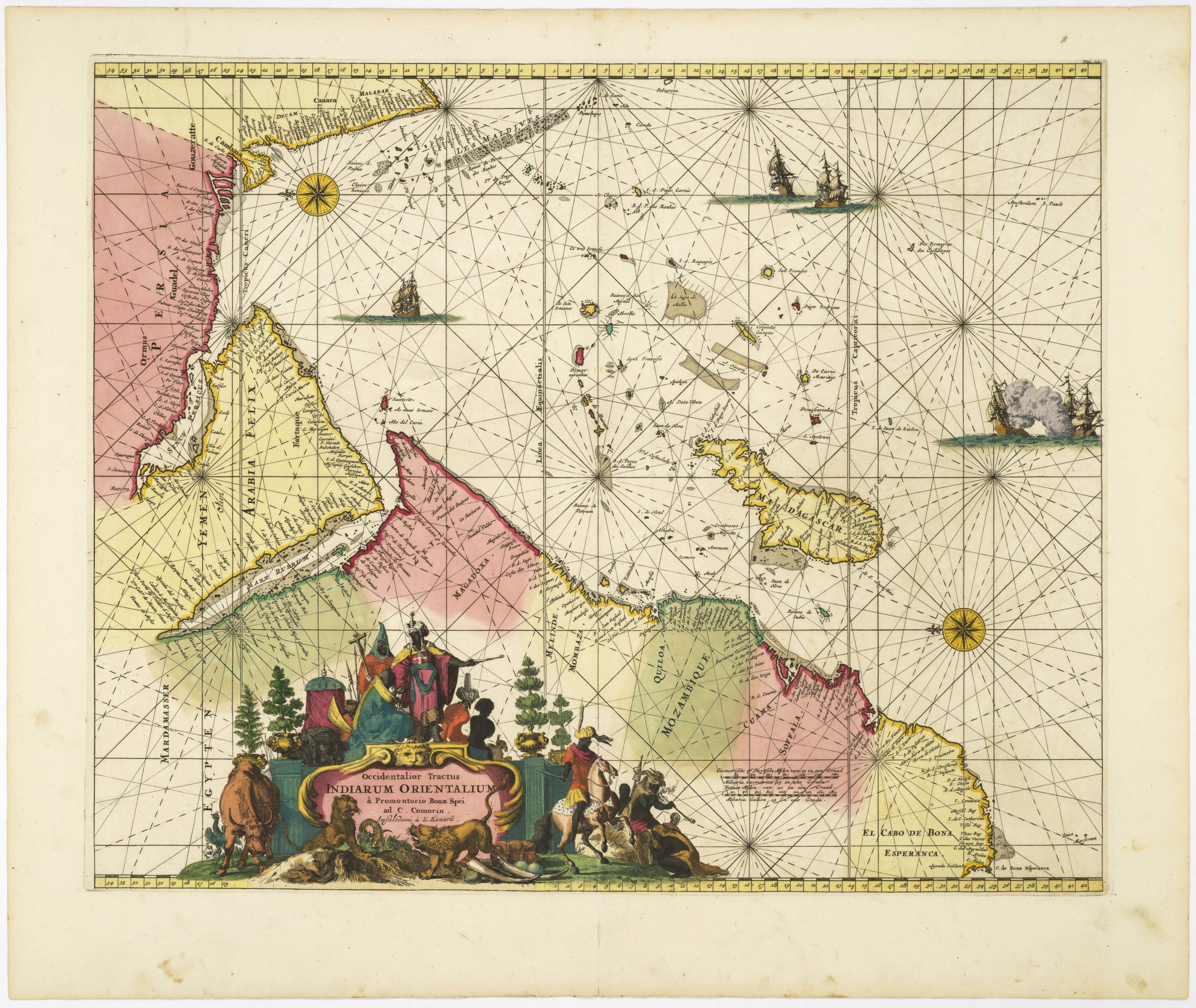
Asia (Accuratissima totius Asiae tabula recens emendata)
De Wit’s chart of Asia is another seminal map in the history of Dutch cartography. Hardly had it hit the market before other local mapmakers such as Justus Danckerts began copying it. The map shows Asia in its entirety: from the Black Sea in the west to the islands of Japan in the east. It also includes Arabia, East Africa, and the Horn. Complex areas, such as the Indonesian and Philippine Archipelagos have been rendered with a new degree of accuracy and confidence. In addition to the exceptional original coloring and remarkable pictorial details such as the Great Wall of China, the Asia map contains several noteworthy elements that will be discussed briefly here.
First of all, there is a delineation of the mystical Japanese island of Yedso. This was not an uncommon feature on late 17th and early 18th century maps and was often – as it is here – associated with the island of Hokkaido. The origins of Yedso’s importance can be traced back to Father Francis Xavier (1506-1552), an early Jesuit missionary to Japan and China. Xavier related stories that immense silver mines were to be found on a secluded Japanese island: a notion that in the following years was strengthened by Spanish traders spreading similar reports. The rumors became so tenacious and widespread that the great cartographer Abraham Ortelius included an ‘island of silver’ above Japan on his 1589 Maris Pacifici map of the Pacific Ocean. Half a century later, the powerful Dutch East India Company sponsored two voyages of exploration to identify and possibly claim this land. The first expedition was led by Abel Tasman in 1639, and the second by Maarten Vries in 1643.
Believing the Kurili island of Urup to be continental, Vries named it Compagnies landt after his employer. He perceived the new land as the westernmost fringe of America and mapmakers gradually adopted this concept, with the variation that Yedso now came to refer to this undefined land. In De Wit’s chart, Yedso has nevertheless been equipped with a number of Dutch toponyms, suggesting a considerable degree of exploration and geographical knowledge.
Also worth noting is the presence of the North Australian coast in the bottom right corner of the map, here appropriately labeled Hollandia Nova. From their base in Jakarta, the Dutch sent several exploratory expeditions to this region – that of Abel Tasman being the most famous – in order to claim this remote land. It was Tasman who in 1644 gave it the evocative name, but the Dutch never really settled here. Consequently, when the British established Sydney and the province of New South Wales as a formal colony in 1788, it was without any opposition from the now significantly weakened Dutch. The term nevertheless continued to be used colloquially until the mid-18th century.
As with the Americas map, this sheet also contains a fine scenic cartouche in the lower-left corner. This time we see a composite depiction of a traditional caravan and the trade associated with it. Oriental traders with turbans and camels appear to be in conversation with other Asian peoples, perhaps haggling over the prices of their goods. Perched atop the wall that forms the foundation for the cartouche text, we find two exotic-looking birds, a bow and arrows, and a large glazed jar. At its base, a large flowing textile presumably represents either the silk or textile trade that stretched across the continent. In sum, we have a singular image that captures the great diversity of both peoples and goods originating in Asia – at least as it was promulgated in the European imagination.
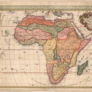
Africa (Totius Africae accuratissima tabula)
The Africa sheet of this amazingly preserved set fully encapsulates why De Wit’s charts were so popular both in his lifetime and today. Very few late 17th century maps depict the African continent with such meticulous care and attention to detail. Even the great Saharan belt, which remains largely void of human settlement to this day, has been extensively annotated, decorated, and labeled. It is a truly impressive chart of a continent still largely underestimated by Europeans.
Like the Asia chart, this became the late 17th century standard for subsequent Dutch maps of Africa. It was reissued a number of times by other mapmakers such as Danckerts, De Ram, Visscher, and others, and reappeared well into the 18th century. Like its counterparts, the Africa chart is De Wit’s original first state, as can be confirmed by the omission of his credentials as privileged, which are found in later copies. As with the other charts, the state of preservation is superlative, with every detail clearly visible, and every speck of original color and gold still in place. That Holland indeed was a maritime nation is manifested through the depiction of no less than seven ocean-liners in the waters surrounding the large African landmass.
We have already noted the impressive degree of detail throughout the continent, and to this may be added a fan of vivid African wildlife scenes, including lions, leopards, rhinos, elephants, monkeys, and ostriches. Yet there are other more esoteric features to note as well. In general, the map shows an overwhelming amount of information concerning waterways. Lakes, rivers, and coastal inlets are depicted in great detail throughout, and the Nile dominates the continent like a large snake. It is clear that De Wit appreciated the importance of the Nile, but his geographic rendition of it is somewhat antiquated – even for the late 17th century. It extends from its delta in Egypt across most of the continent, connecting to a huge Central African lake labeled Zaire Lacus. This notion predates De Wit by more than a millennium in that it comes from the Ptolemaic understanding of African geography.
A significant swathe of the interior in southern Africa has been labeled as the Kingdom of Monomotapa (Mono-um-Motape Imperium). This kingdom, which was established by a prince of Zimbabwe in the early 15th century, extends as far down as the Rio de Infante in modern South Africa. Portuguese mariners encountered its people in the course of their voyages down the African coast and around the Cape.
A final note should be made on the elaborate and decorative cartouche. Once again, it offers little textual information other than the map’s title, maker, and place of origin, but the imagery is loaded with powerful symbolism. The textual tenement is crowned by two rather regal-looking male lions. To the left, we see three adult figures in discussion representing the peoples in and to the north of the Sahara. To the right, we find sub-Saharan Africans represented in the form of a chief, a child, and two other figures. One of them sits atop a domesticated elephant. Thus, we once again see in the imagery an attempt to encapsulate the vastness and diversity of this continent.
Europe (Nova et Accurata totius Europæ Descriptio)
De Wit’s chart of Europe was also important in that it was accurate and beautifully decorated, and thus almost automatically in demand. Just like today, the appeal of each map was considerably augmented by the existence of the three others. In this way, De Wit’s maps became (and remain) most desirable as a complete set.
By the late 17th century, Europe had of course been extensively documented and mapped for centuries, and other than political divisions and new developments, there was not much of novelty value to add. Consequently, many maps of Europe as a continent begin to focus on other elements that might make that particular chart appreciated and desirable.
In this case, we see the inclusion of plentiful topographic features, gilded compass roses, and figurative depictions. In all four maps, ships constitute a core decorative element in the maritime sphere, but in the European chart, an Ortelian sea monster and a large figure of a woman riding a bull in the Atlantic have expanded the repertoire. The latter is Europa herself, a Phoenician princess that according to Greek mythology was seduced by Zeus who had taken the form of a bull. Above her, we find a more traditional scroll-like title cartouche carried by putti. While perhaps the most well-documented geographic area in the set, the Europe map stands out because of its overtly golden sheen, created by highlighting every major township of the continent with a dot of gold.
Cartographer(s):
Dirck Jansz van Santen (1636-1708) was a leading Dutch colorist in the 17th century. His primary occupation was coloring the great Dutch atlases, but Van Santen also illuminated Bibles and illustrated books on poetry, gardening, astrology, and history.
He was born in Amsterdam in 1636, as the son of Jan Jansz van Santen, who had been a member of the local booksellers’ guild since 1651 and whose own publications date to the 1650s and 60s. In 1653, Jan Jansz bought a house on Oudezijds Kerkhof for 4,000 Florint, indicating that the family was relatively well off.
In addition to training in his native Amsterdam, evidence suggests that Van Santen went to Paris to work on several projects. He may even have been hired by Louis XIV as a colorist for his atlases and Bibles. He certainly worked for prominent citizens in Amsterdam, including the mayor, Nicolaas Witsen (1641-1717), and Laurens van der Hem (1621-1678), a wealthy Amsterdam lawyer and collector. When van der Hem died in 1678, Van Santen had probably been working for him privately for years. Among van der Hem’s many treasures was an enlarged version of Blaeu’s eleven-volume Atlas Maior (1662). Var den Hem’s version consisted of no less than 46 regular and 4 supplement volumes, totaling more than 2,000 maps, prints, and drawings, all of which had been expertly colored by van Santen. The van der Hem atlas was an Amsterdam attraction, in part due to van Santen’s exquisite decoration. Eminent foreign visitors came to view it, including the Medicis, the grand dukes of Tuscany, who offered an enormous sum for the bound portion of the Atlas (33 volumes), but to no avail.
It is not inconceivable that Van Santen set up his own print shop, or at the very least maintained a close relationship with one or more established publishers. But he also worked privately for wealthy Amsterdam collectors like Willem van Beest and Jacob Cromhout both of whom owned large collections of Van Santen illuminations.
Dirck Jansz van Santen died in 1708, well over the age of 70, and was buried in the Leidse Kerkhof in Amsterdam.
Frederick de WitFrederick de Wit (1629–1706) was a Dutch cartographer and artist who drew, printed, and sold maps from his studio in Amsterdam. He was a pioneer of Dutch Golden Age cartography, and the founder of one of the most famous map-publishing houses in Amsterdam. He was born in Gouda but moved to Amsterdam at the end of the Thirty-Years-War (1618-48), which had engulfed most of Europe and ultimately liberated the Netherlands from centuries of Spanish dominion.
Soon after arriving in Amsterdam, probably in 1654, De Wit opened a printing shop named The Three Crabs (De Drie Crabben). A year or two before, he had married Maria van der Way, the daughter of a wealthy Catholic merchant, and this may have helped secure the funding to start his new operation. His aspirations as a cartographer were nevertheless made clear when he shortly after changed the name to The White Chart (Het Witte Pascaert), under which he gained international renown.
In the latter half of the century, De Wit began drawing, copying, and publishing atlases and maps. By the 1670s he was issuing large folios with up to a hundred maps in each tome, including a famous nautical atlas in 1675. From 1689, De Wit received a state privilege from the Dutch government to draw and issue maps. This protected his work from the illegal copying known from his earlier charts. De Wit was among the first to apply extensive coloring and his original color atlases and continental charts remain highly sought after to this day.
Following De Wit’s death in 1706, his wife ran the business for four years before selling it at auction in 1710. Their only surviving son was a successful merchant in his own right and had no interest in taking over. At the 1710 auction, most of De Wit’s plates were sold to Pieter Mortier, another Amsterdam cartographer and engraver. After passing the firm to his son, who teamed up with Johannes Covens, the firm became Covens & Mortier, the largest cartographic publisher of the eighteenth century.
Condition Description
Together 4 double-page engraved maps, fine contemporary hand-color, heightened in gold.
America: 53 x 61.4 cm (20.9 x 24 in); Asia: 53 x 62 cm (20.9 x 24.5 in); Africa: 53 x 62 cm (20.9 x 24.5 in); Europe: 53.5 x 62 cm (21 x 24.5 in)
References
Carhart, George Frederick de Wit and the First 'Concise Reference Atlas': A reexamination of the Amsterdam map, print and art seller's life, work and contribution to the distribution of cartographic knowledge during the second half of the 17th and early 18th centuries. Doctoral dissertation from the University of Passau (completed 02/2011).