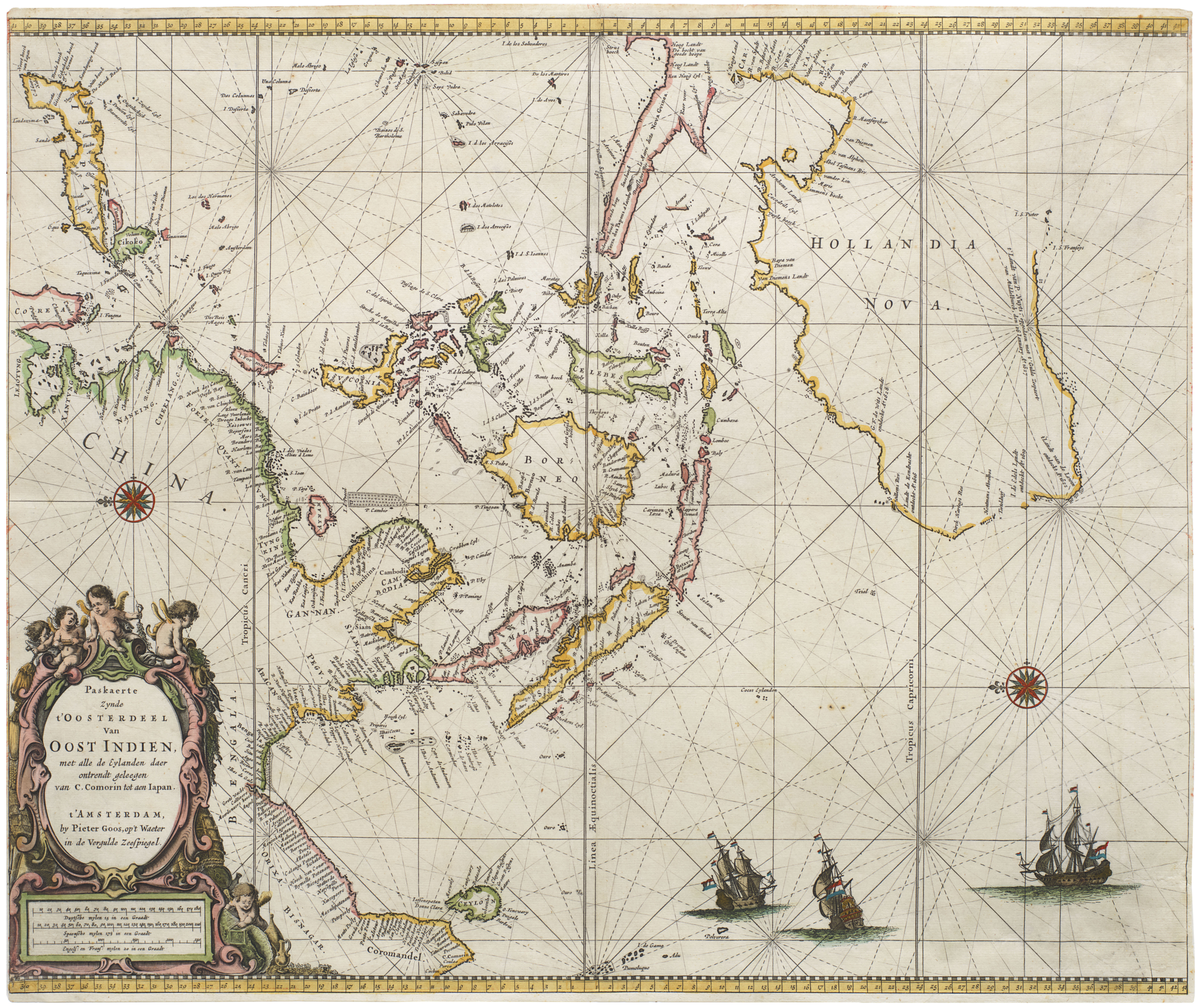
Spectacular old color 1593 De Jode map of Asia, with important depiction of Taiwan and the Great Wall of China.
Asia, Partium Orbis Maxima
Out of stock
Description
A true collectors’ item — rare and beautiful, with original color.
Marvelous example of Gerard de Jode’s map of Asia (originally based on the landmark work of Giacomo Gastaldi), published by his son Cornelius in Speculum Orbis Terrae.
Among the notable features is a depiction of the Great Wall of China, highlighted in red and complete with towers, protecting the Chinese Empire along its northern border.
The geography shown on the map is an interesting mix of 16th century notions of East Asia, a region still largely misunderstood in Europe. To the south of an oddly shaped Japan, De Jode follows Ortelius’s (1570 Asiae Nova Descriptio and Indiae Orientalis) depiction of the Ryukyu island chain, with one important exception. Both cartographers use the terms Lequiho and Lequio to label islands in the chain, and both name Formosa (Taiwan). Furthermore, both seem to make the same error in applying the label I. Fermosa to one of the smaller islands to the north. As T. Suárez points out, true Taiwan would instead seem to be the island of Lequiho pequinho to the south at the correct latitude, being centered at about 25º north (Taiwan spans 21º 55’ to 25º 15’). The crucial difference between this map and those of Ortelius is that De Jode’s Lequeio minor is much larger and more prominent, as well as closer to its true position north of Luzon.
As such, this map represents a key development in the mapping of Formosa/Taiwan.
Southeast of Japan, along the right side of the map, we see the Mariana Islands, mapped as a vertically-distributed archipelago. Magellan’s expedition visited these islands, calling them the Islas de los Ladrones (‘islands of thieves’) after a dispute with the native inhabitants. On this map De Jode uses the other prevalent appellation for the archipelago: Islas de las Velas Latinas, the ‘islands of the Lateen sails,’ named for the triangle-shaped sails on the canoes used by local mariners. An I. das Ladrones does appear, but has been shifted north just off the east coast of Japan.
To the south of the Marianas, a strange landmass emerges from the bottom right corner of the map. At first glance, it would appear to be Australia, but it is actually a depiction of New Guinea. At the time of the map’s publication at the end of the of the 16th century, mapmakers were still divided as to whether New Guinea was an island or represented a northern promontory of a massive southern continent, terra australis. The map leaves the question of New Guinea’s insularity unanswered, as it extends out of frame, but its massive size and presentation of a northern coastline with several place names invoke an attachment to the mythical “Austral continent.” Despite many voyages of exploration in the region, most notably those sponsored by the Dutch East India Company, questions as to the existent of a southern continent, and New Guinea’s possible relationship to it, would not be resolved for centuries, until the voyages of Captain James Cook. Even then, the definitive mapping of the southern coast of the island was not achieved until the 19th century.
Other interesting elements include a complete lack of Korea, the existence of Singapore (labeled Sinapura), and a depiction of the Philippines with more accuracy than many contemporary maps.
The title is set in the classic late 16th century Dutch-style panel with strap-work designs and two figures.
Background: How to understand color on antique maps
The terms ‘Original’ or ‘Contemporary’ or ‘Old’ color are used for the most part interchangeably in the antiquarian map world to refer to color that was applied to a map immediately after or close to the time of its printing as part of the publication and selling process. Until the development of color printing (halftone, chromolithography, etc.), maps were colored by hand: sometimes by the publisher or people hired by the publisher, sometimes by independent colorists working for the map’s owner.
‘Modern color’ is used to describe color that was added long after initial production, even if the color is centuries old. Both in cases where original coloring faded or burned, and when maps were issued without color, it is not unusual to find 17th century maps colored (or re-colored) in the 18th and 19th centuries. This color is grouped with the work of present-day colorists under the term ‘modern,’ and when skillfully applied both can be quite visually pleasing.
Historical background
For most of the history of mapmaking, color was uncommon but not unknown.The oldest known maps were incised into clay tablets in ancient Babylon and could obviously not be colored. But as the medium evolved, we see that for some of the earliest preserved maps, coloring played an important role in encoding or embedding concepts in schematic visual renditions of the world. Impressive charts like the Tabula Peutingeriana, early Arab or Ptolemaic maps, the 6th century mosaic map in Madaba, Jordan, and Medieval portolan charts all used color to distinguish individual features and enhance the visual impact.
From the late 15th to the late 16th century, a period that saw the invention of the printed map and the rise of map publishing as a business, color remained uncommon. Maps would often figure within the context of geographic books or itineraries and would rarely be subjected to coloring. However, some map publishers did begin to color maps in order to make them more sellable by enhancing appearance and readability, as well as to highlight specific features conveyed in the map’s composition.
Coloring would be applied to maps for decorative purposes, and the more competitive the map business became, the greater the need to enhance them visually. During the 17th century and the Dutch Golden Age of cartography, the hand coloring of maps grew increasingly common and popular, and many mapmakers started issuing formal polychrome sheets to meet the growing demand. A pioneer in this regard – in part due to his technical skill and strong sense of aesthetic – was Willem Janszoon Blaeu, who began issuing magnificent tomes of hand-colored maps.
The depth and splendor of early coloring was in part due to the way pigments were prepared and used. Some of the pigment initially used in the hand-coloring of maps became unavailable during the 18th century, making the original techniques a lost art. Coloring was used in different ways and for different purposes. Four main colors were usually used to highlight political subdivisions: green, pink, orange, and yellow. A stylized cathedral colored in bright red or gold often marked larger urban centers, whereas blue was commonly reserved for denoting bodies of water. Black was the color most used for toponyms.
Discerning old color
If skillfully applied with historical correctness, modern coloring can sometimes be very difficult to distinguish from contemporary or original color. Discerning between the two takes experience.
When evaluating maps for original color, there are a number of features that one might look for in order to confirm that the coloring is indeed original. The most common and simple technique is to examine the verso of the map, as old greens and browns in particular often show through the paper as a result of oxidation.
Another common, albeit more difficult, way of discerning original color from later coloring is holding it up to historical and stylistic scrutiny. Often, the original coloring of landmasses constituted a reflection of political subdivisions at the time of publication. Such realities would sometimes either be forgotten or disregarded when maps were subjected to later coloring. The reason for discrepancies of this sort was usually the changing nature of political realities. The later coloring of maps with different political subdivisions could thus be construed as an error in historicity, but is much more likely because the desire for original states is a modern collectors phenomenon. In the 18th and early 19th century, far more importance was lent to maps be usable, and thus the need for updated political divisions was considered paramount.
Cartographer(s):
Gerard de Jode (1511-91) was a Dutch printer and mapmaker born in Nijmegen, but working from the metropolis of Antwerp. One of the most competent and reputable Dutch cartographers of the 16th century, he did not fare so well business-wise, as competition was stark and his mercantile sense perhaps not so shrewd. In 1547 he was accepted into the Guild of St Luke’s in Antwerp and began working as a publisher and printer. De Jode quickly gained recognition as an expert mapmaker in a city that was already renowned for its cartographic output. His greatest achievement was a magnificent two-volume atlas entitled Speculum Orbis Terrarum, which came out in 1578. The idea was to create an atlas that could compete with Abraham Ortelius’ hugely popular Theatrum Orbis Terrarum, which had been published to great acclaim only eight years earlier. Despite De Jode’s status and reputation, however, his atlas was not a commercial success. The lack of circulation in 1578 has had a lasting legacy today, as it is now one of the rarest and most sought-after atlases, with only about a dozen copies known to exist.
Despite this lack of commercial success (or perhaps because of it), Gerard began working on a new and revised atlas. For this task, he recruited his son, Cornelis De Jode (1568-1600), as an assistant, and together they compiled another outstanding and innovative atlas entitled Speculum Orbis Terrae, which was published in 1593. Sadly, Gerard de Jode died of old age a little less than two years before its publication, but perhaps he was spared the embarrassment of another commercial failure. Even though the new atlas contained both Gerard’s original maps, it also included several key revisions, and perhaps most importantly, a range of entirely new maps compiled by Cornelis himself.
Like their 1578 predecessors, these 1593 maps are also scarce, especially since after Cornelius’ death, the engraving plates were sold to his competitor, J. B. Vrients (who also owned the Ortelius plates), who assured the complete work was never published again. Thus, while numerous editions of Ortelius were published and survive today, only the 1578 and 1593 editions form part of the legacy of the De Jode family.
Condition Description
Excellent condition.
References
Suárez, Thomas. Early Mapping of Southeast Asia: The Epic Story of Seafarers, Adventurers, and Cartographers who first mapped the regions between China and India. Singapore: Periplus, p. 165.
Suárez, Thomas. Early Mapping of the Pacific. Hong Kong: Periplus, 2004.
![[Northern India and Pakistan] Tabula Asiae IX.](https://neatlinemaps.com/wp-content/uploads/2023/07/NL-00244-NEW_thumbnail-300x300.jpg)
